Most public transport tickets are understandably simple – they need to be easy to print, easy to read and contain a certain amount of information.
Simple, though, should not equate to ugly. Think about your last transport ticket, chances are it was pretty badly designed. There is a great write up about this that I found a few years ago by Tyler Thompson, wherein he attempts to redesign the boarding pass. It is definitely worth checking out here, if only because it includes the quote:
“It was like someone put on a blindfold, drank a fifth of whiskey, spun around 100 times, got kicked in the face by a mule (the person who designed this definitely has a mule living with them inside their house) and then just started puking numbers and letters onto the boarding pass at random.”
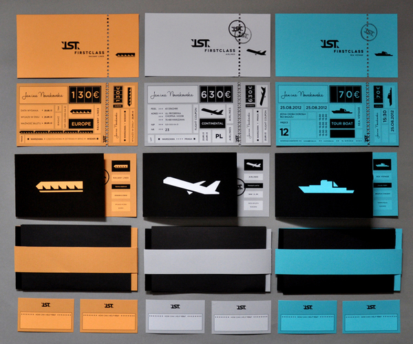
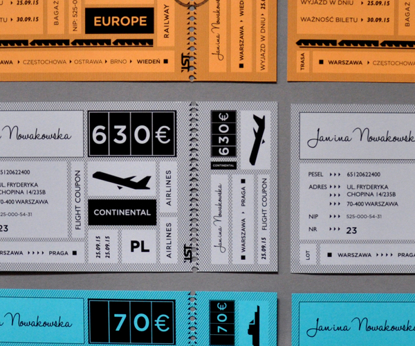
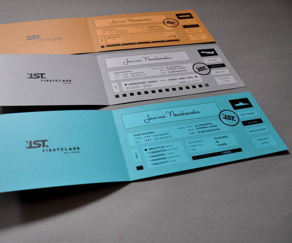
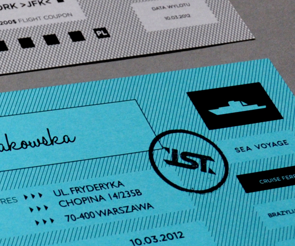
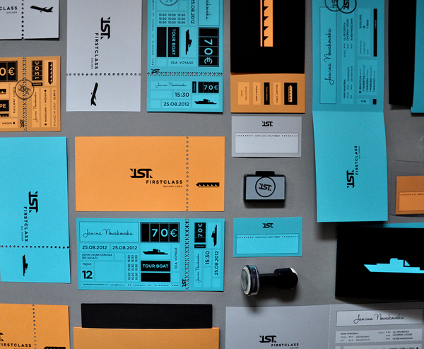
Today’s project is by Polish student Martyna Wędzicka and is the perfect example of how tickets should look.
 |





You’re very welcome! Your tickets are super cool!